Launching a research-based integrated campaign focused on new movers to North Carolina and South Carolina
Summary
Insights from a physiological-based usability study facilitates the development of a primary digital touchpoint
Carolinas HealthCare System, now Atrium Health, is an integrated nonprofit healthcare system based in Charlotte, North Carolina. With a commitment to every community it serves, Atrium Health seeks to improve health, elevate hope and advance healing – for all. The team at Atrium Health reached out to the agency to further raise awareness about its services and achievements through an integrated marketing campaign.
Continuing, my role as the user experience designer of the project was to establish an understanding of the digital ecosystem. The ecosystem consisted of multiple campaign landing pages serving as integrated campaign touchpoints. Two primary user flows related to finding care emerged.
This process included gaining an understanding of users through qualitative research, implementing proper usability practices, and utilizing an iterative design approach based on feedback from users, project team members, and client stakeholders. The project completion took place between December 2016 and January 2017.
Role | Evaluative research, Strategy development, UX design
Timeline | December 2016 – January 2017
Collaborated with | Account management, Project management, Design, Development, Internal stakeholders
Project team members | Lori Cooper (Group Account Executive), Lauren Bosse (Account Executive) Melinda Bowles (Project Manager), Tim Wagner (Technical Lead), Eleanor Veazie (Digital Designer)
Project goals
The Carolinas HealthCare digital campaign experience, prior to the new campaign, occurred across three separate but visually similar websites. The first experience focused on finding urgent care. The next experience focused on finding primary care. The series of landing page experiences also contained an assortment of locations pages and contact forms. To ensure the attainability of project goals, the project employed the SMART acronym, which stands for Specific, Measurable, Achievable, Relevant, and Time-bound.
Goal one | Conduct an eye tracking study on the Carolinas HealthCare System landing pages to understand how users interact with those pages.
Goal two | Analyze the eye tracking study results from the Carolinas HealthCare System landing pages to identify key user behaviors and areas of engagement or confusion.
Goal three | Use findings from the eye tracking study on the existing landing pages to guide the development of wireframes for a new integrated campaign.
Strategies that resulted in an acceptable increase in conversation rate served as a secondary research element in the project. Collectively, these objectives molded a comprehensive user experience strategy for the new digital campaign.
Studies
The study, which used the Tobii Eye tracking platform, involved the creation of a simulated physical environment where participants could navigate and interact with the existing Carolinas HealthCare System in a relevant context. An interactive design tool facilitated the data collection on user interactions throughout the landing page experiences. Participants engaged in two studies, each using a prototyping tool that showcased the Carolinas HealthCare System landing pages. In total, five participants completed each of the studies.
In an early article published on the NN Group website, Jakob Nielsen concluded that testing with just five participants could unveil usability issues as effectively as testing with a larger group. Keeping this insight in mind, the study design for the Carolinas Healthcare landing page ecosystem emphasized iterative testing, specifically with five participants per study. The ultimate goal was to integrate this iterative testing approach into future projects within the Carolinas HealthCare system.
Study one | Find urgent care
Task one | Urgent Care landing page
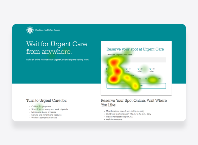
The “Find Urgent Care” study focused on the experience of finding. The form on the page received the most visual attention. The page headline received only minimal attention. Similarly, the content section on the left side of the screen attracted limited attention.
The task coincided with the visual attention given to the form. In this instance, the hierarchy of filters was a key consideration. Beyond the location text field, the form incorporated a radio button group for distance and a checkbox group for on-site staffing requirements.
A potential future study could evaluate the role of filters in searches for healthcare services. Heatmap data indicated a lack of contrast between the button and the rest of the user interface. This insight pointed towards a potential area for further investigation.
View the full version of the Urgent Care page heatmap →
Task one | Locations page
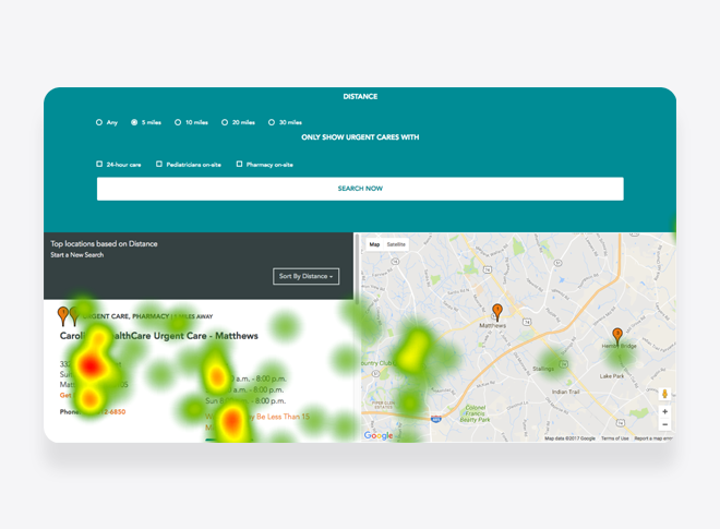
Participants in the study navigated to the “Locations” page. On this page, visual attention diminished in intensity from left to right, forming a spotted pattern. This pattern emerged as participants scanned for specific information.
Similar to the form component on the landing page, the hierarchy of the location details component was also noted. The complementary use of orange to denote relevant links and information effectively garnered attention from participants.
View the full version of the Locations page heatmap →
Study two | Find care
Task one | Homepage
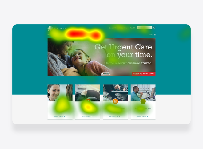
In the second study, participants had the task of seeking medical care using the Carolinas HealthCare digital platform. The starting point for this task was the website’s then-current homepage. Results revealed that the primary focus of visual attention fell on two specific links: “Make an Appointment” and “Get Care Now.”
In addition to the primary links, attention was also drawn to the card components on the page. These cards included links to “Find a Doctor,” “Find a Location,” and “Make an Appointment.” Notably, among these cards, “Find a Location” received the most visual attention from the participants.
View the full version of the Homepage heatmap →
Task one | Find a Location page
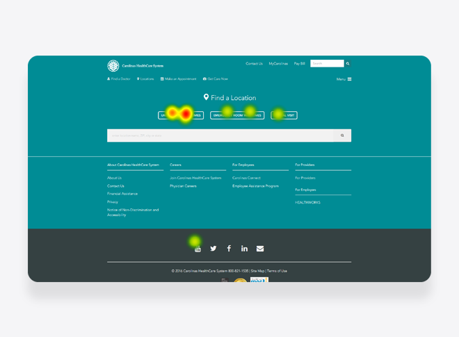
The subsequent path of interaction was the “Find a Location” link. A noticeable pattern emerged where participants specifically focused on buttons corresponding to different location types. These location types included options such as “Urgent Care Wait Times,” “Emergency Room Wait Times,” and “Virtual Visit.
The data provided by the heatmap indicated the necessity for further testing. The data contained in the heatmap highlighted a clear hierarchy between text fields and buttons, where buttons attracted more attention and users largely ignored the text field. Interestingly, attention was also paid to the YouTube social media icon. This observation raised questions about the role of social media within the healthcare industry.
View the full version of the Find a Location page heatmap →
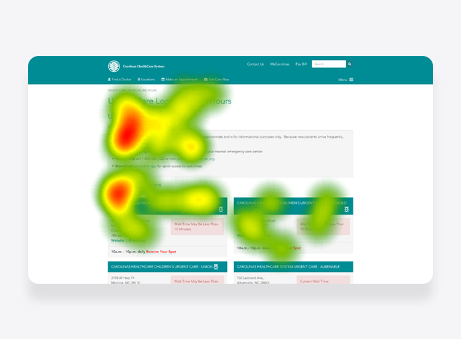
Task one | Urgent Care Locations and Hours page
After participants selected the “Urgent Care Wait Times” button, they navigated to the “Urgent Care Locations and Hours” page. This page established a content component that provided approximate and informational details. It included the current wait times, instructions for life-threatening emergencies, a poison assistance link and phone number, as well as a link to download the mobile app.
This content component attracted the majority of attention, but participants also focused on two location cards. These cards shared key information like address, approximate wait time, operating hours, a link to the urgent care website, and a link for travel directions to the urgent care location. Additionally, each card offered a “Reserve Your Spot” link.
Compared to other components throughout the digital experience, the urgent care content components adopted a distinct approach to content hierarchy. The design emphasized the urgent care location name, and used color to highlight critical information. Furthermore, these elements appeared in a grid view rather than a list, with no option provided to view them on a map. This insight pointed towards another potential area for further investigation.
View the full version of the Urgent Care Locations and Hours page heatmap →
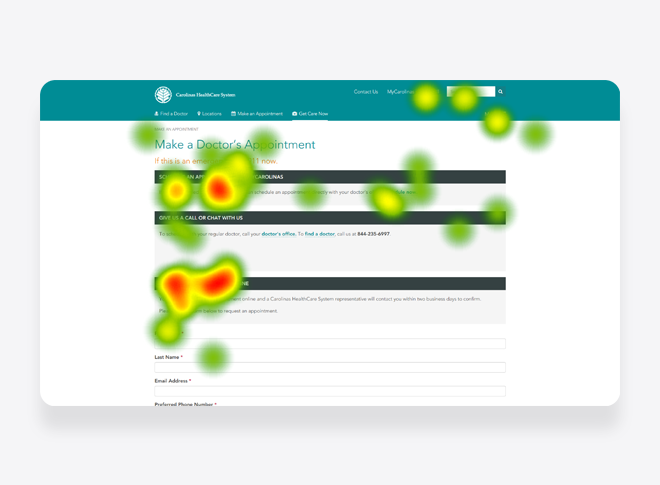
Task One | Make a Doctor’s Appointment page
Participants also navigated from the homepage to the “Make a doctor’s Appointment” page. This page incorporated the content component from the “Urgent Care Locations and Hours” page, with a few differences. The page presented three full-width content components: “Schedule an appointment with MyCarolinas,” “Give us a call or chat with us,” and “Request an appointment online.”
Each component contained links leading to additional pages, including “MyCarolinas,” “Schedule now,” “doctor’s office,” and “find a doctor.” A phone number was also provided for further assistance.”
The full-width display of content on this page initiated an F-shaped reading pattern. The page had a form associated with online appointment requests, and it marked each field as required. Insights from the page indicated another opportunity for conducting a usability study on form usage and content component hierarchy.
View the full version of the Make a Doctor’s Appointment page heatmap →
DESIGN
Introduction
Following the insights gathered from the usability studies and industry secondary research, the project moved to the next phase, focusing on the development of two landing page concepts. The first concept revolved around an area directory, designed to provide new movers with relevant and timely information. The second concept aimed to communicate the abundance of physical activities available throughout the area.
Iteration One | Area Directory
The first iteration transitioned the campaign landing page into a website homepage. The concept presented a clear value proposition highlighting the website’s focus. It encompassed multiple content areas, ranging from information on counties in the Greater Charlotte area to a new movers guide, individual articles on local activities, and a section for volunteer information.
Below the volunteer content section, there was a group of care options mimicking the model from the then-current homepage. This section offered links to “Find a Doctor,” “Find a Location,” “Make an Appointment,” “Start a Virtual Visit,” and “Get Care Now.”
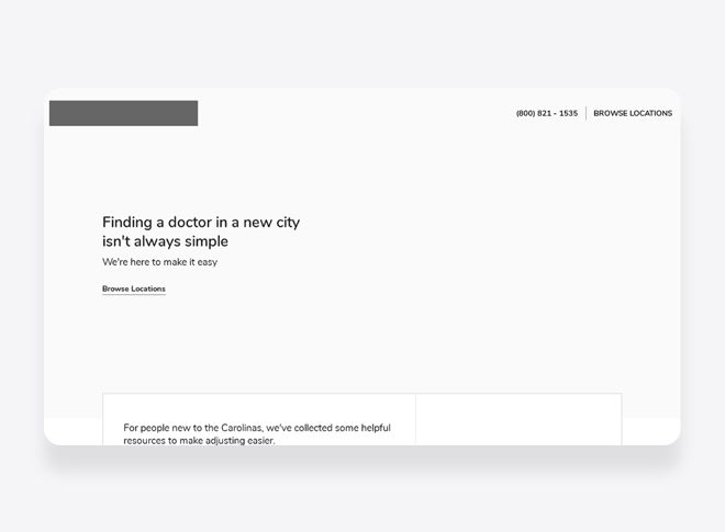
Beyond multiple content areas, the design incorporated several key performance indicators to track the success of the new movers campaign. In this landing page iteration, these indicators encompassed “Start Application Process,” “Download New Mover’s Guide,” and a designated telephone number.
View a full page desktop wireframe of this Area Directory concept →
Iteration two | Area Activities
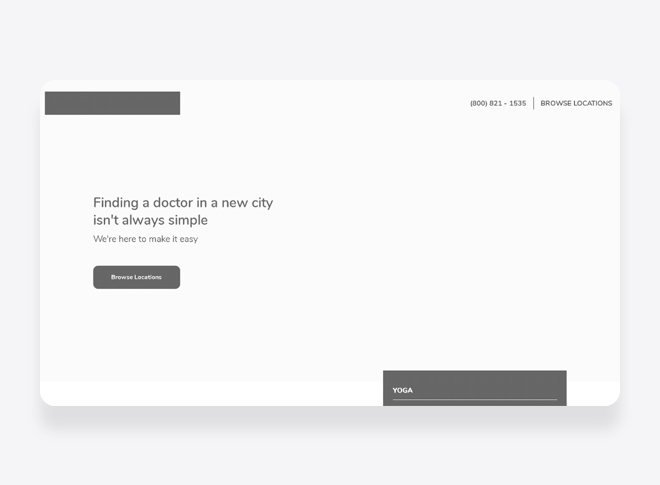
The second landing page iteration aimed to simplify messaging and foster rapport with users interacting with the page. The area activities content highlighted popular, readily accessible physical activities within the Greater Charlotte area.
This iteration strategically positioned relevant activity content. One of the suggested focal areas was to feature care providers passionate about certain physical activities. Such content could not only cultivate trust with users interacting with the landing page but also prompt action.

This iteration also transitioned to a single key performance indicator. Although the wireframe initially displayed “Browse Locations” as the button label, it later changed to terminology associated with downloading the new movers guide. This iteration also featured a phone number to track user contacts.
View a full page desktop wireframe of this Area Activities concept →
Closing thoughts
The digital designer of the project took over the second version of the landing page, marking a shift towards design refinement and content modification. The final design broadened the range of physical activities featured.
As for the project’s success, the data was not disclosed. However, this project stood as one of the first in a series of many. Moreover, the agency established a new location in the Charlotte area to better serve the client.
