Elevating the digital experience to reflect the high level of customer service and customer dedication
Summary
Generative and evaluative usability studies inform the development of an omnichannel consumer utility experience
EPB is a regional utility provider located in Chattanooga, Tennessee that serves counties in Tennessee and Georgia. They offer electric services along with fiber services such as internet, television, and phone. Innovation is not usually associated with utility providers, but EPB was the first company in the United States to install a community-wide fiber network. As a technology provider with award-winning customer service, the team at EPB reached out to partner with the agency to create a digital experience that meets and exceeds customer expectations.
As the user experience designer for this project, I gained an understanding of EPB’s operational ecosystem, identified crucial user flows, and created wireframes that integrated key performance indicators and user goals seamlessly. The primary focus of this case study is the user flow between residential services and support.
This process involved understanding users through qualitative research, implementing proper usability practices, and using an iterative design approach based on feedback from users, project team members, and client stakeholders. The completion of this project occurred between December 2014 and August 2015.
Role | Generative research, Information architecture, Evaluative research, UX design
Timeline | December 2014 – August 2015
Collaborated with | Account management, Project management, Design, Development, Internal stakeholders
Project team members | Amanda Lewis (Account Executive), Sonia Brisson-Smith (VP, Director of Digital Production), Matt Lynberg (Technical Lead), Michael Russell (Front-end Developer), David Furman (Front-end Developer), Jason Reyna (Digital Designer), Mary Beth Ross West (User Researcher)
Discovery
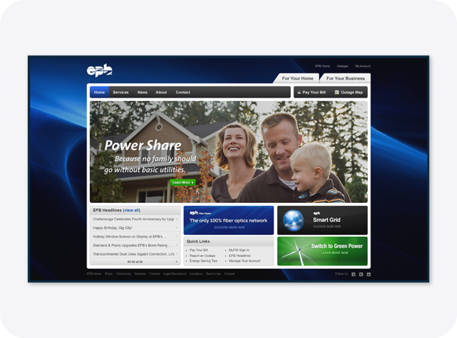
The EPB digital experience, prior to the website redesign, occurred across two separate but visually similar websites. The first experience focused on electric services, commonly referred to as power by the internal stakeholders. The new experience’s information architecture integrated this nomenclature. This website also featured content sections related to energy efficiency and sustainability.
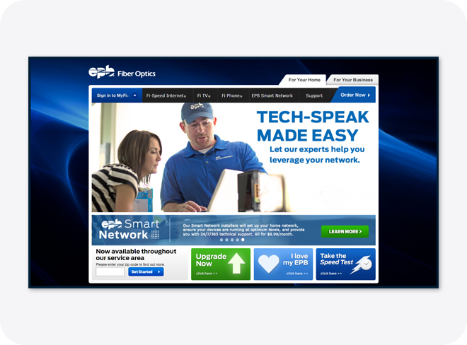
The second website of the EPB digital experience focused on fiber services, including Internet, Television, and Phone. This website included relevant information for each service but also secondary content sections and service management actions.
In addition to these two digital experiences, the website featured three distinct user groups including residential users, commercial users, and builders and developers. The shifts in user group content types created a unique ecosystem.
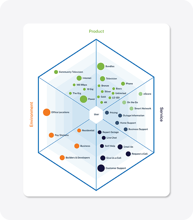
In addition to shifts in content types and content groups, EPB also had an extensive assemblage of customer support channels. Aside from digital channels, physical locations provide users with different types of account-related services.
In collaboration with the project manager, I conducted a content audit to inventory, organize, and evaluate all types of content across EPB’s digital experience. This included web pages, content pages, landing pages, downloadable resources, videos, etc. This helped to eliminate redundant material, enhance SEO, and plan for future content development.
Project goals
Since EPB is a part of the government-owned infrastructure in Chattanooga, Tennessee, market dynamics had limited influence on setting goals. Before I joined the project team, the user researcher conducted a survey to gather more insights into user behavior. Utilizing these insights, and to ensure the attainability of project goals, goal identification used the SMART acronym – Specific, Measurable, Achievable, Relevant, and Time-bound .
Goal one | Combine two existing websites into a single, user-friendly service system that proactively educates users about the products and provides customer support.
Goal two | Improve the accuracy of product expectations by presenting information in small, digestible chunks for easier comprehension.
Goal three | Enhance the digital platform to allow users to personalize their experience and more easily find information and assistance.
In addition to these three goals, the website’s primary key performance indicator, new orders, influenced content components throughout the site. Together, these goals shaped a comprehensive user experience strategy.
Information architecture
A mixed-method approach, using card sorts and tree testing, facilitated understanding of the relationship between site structure, navigation nomenclature, and user behavior.
The consolidation of two separate websites and the understanding of content through inventory, analysis, and planning led to the development of an inclusive digital experience for users.
Continuing, a tree test strengthened awareness on how users find information related to specific, real-world tasks. This user-centered research method provided insight on how users interact with a website’s main content categories and sub-categories.
With the content groups established by the tree test data, the next step was to refine the information architecture. By organizing and structuring content, users are able to understand their current location within the website and the information available to them.
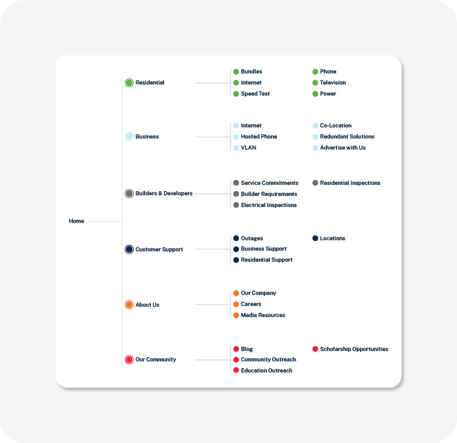
Effectively organizing the content also helps set up mental models associated with the website by providing cues on what users can expect on the website. Information architecture is one of the most important aspects of a website due to the impact on findability and usability. A sitemap helped illustrate the website navigation and the relationship between users and content to internal stakeholders.
Design
After sharing the hierarchical organization, the next step was to create a framework of a website using wireframes. Wireframes connect the website’s information architecture to its visual design by showing paths between pages. In addition, wireframes provide the opportunity to consistently display different types of information. Wireframes are also used to define content hierarchy on a page by page basis. Continuing, wireframes help determine functionality in the interface.
To proactively educate users about the services and provide customer support, the wireframes initially tested the idea of including a content component of four items on the homepage. Each labeled item acts as a frequent access point into the service ecosystem. The initial strategy was to provide an access point into fiber services for your home that mirrored the drop-down navigation.
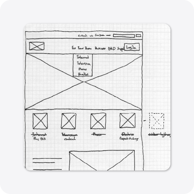
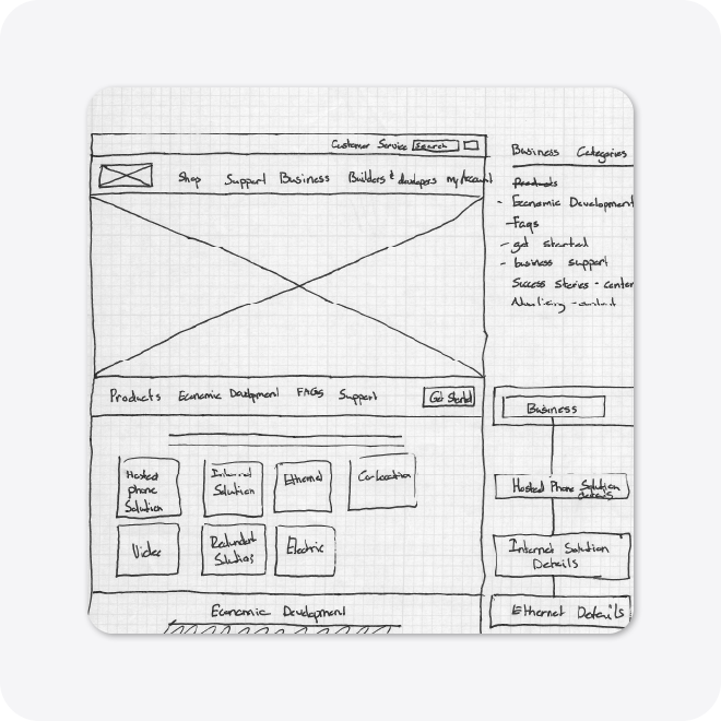
The sketch also served as a test version of the site map that focused on each audience. Primary navigation links included “For Your home,” “Business,” “Builders & Developers,” “Support,” and “Log in.” The goal of this iteration was to empower each user group to personalize their experience and find information and assistance more easily. A secondary navigation containing the link “Customer Support: (423) 648 – 1372),” and a search function also provided easy access to the service ecosystem.
In an iteration of a category page, in-page navigation via anchor links moved users down to key service offerings. This navigation area also contained a ‘Get started’ button. This component allowed users to personalize their experience and find information and assistance more easily. Although mobile usage was low for the previous iteration of the EPB digital experience, this in-page navigation also provided a way to find information in a mobile-friendly manner.
This wireframe iteration also included an alternative navigation structure. The main navigation contained “Shop,” “Support,” “Business,” “Builders & Developers,” and “My Account.” The secondary navigation contained a “Customer support” link and a search area. This navigation was one of the two information architectures under discussion. This wireframe also explored a content module for displaying relevant and timely service links.
The next wireframe sketch also contained an iteration of the main navigation. The primary navigation contained ‘For Your home,’ ‘For Your business,’ and a ‘Login’ button. One of the primary differences from the other iterations was the scrollable secondary navigation that contained the key product categories. This menu system also enabled users to find information in a mobile-friendly manner.
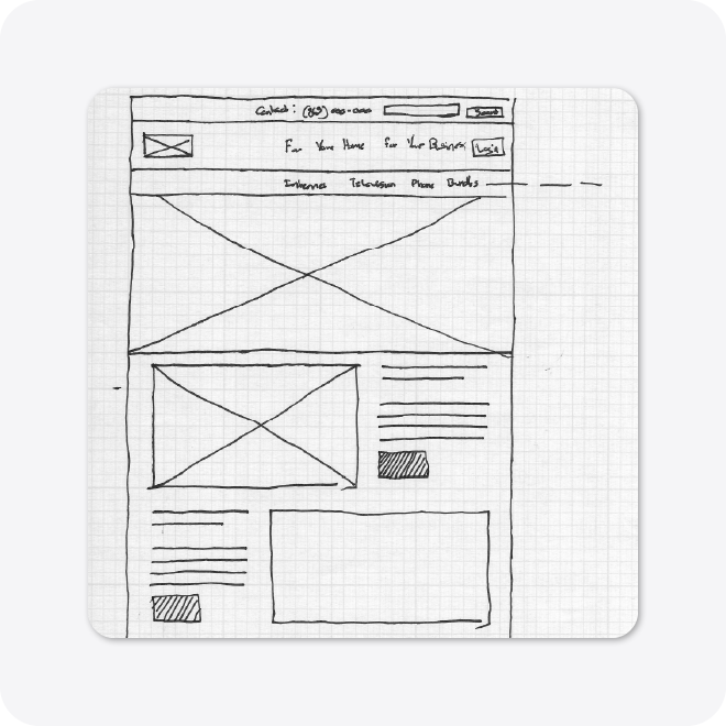
This iteration of the wireframe also focused on communicating product expectations by presenting information in small, digestible chunks for easier comprehension.
Homepage wireframes
Introduction
The overarching strategy for the homepage focused on content components that facilitated user education about the services and provided customer support. As noted in the sketch wireframes, the crucial area on the homepage was the support access links. In addition, each of the homepages featured content components that communicated information in small portions.
The initial iterations of the homepage also aimed to keep the content components focused to minimize the page length. With wireframing occurring in conjunction with information architecture planning, these wireframes reference “Power” as “Electric.”
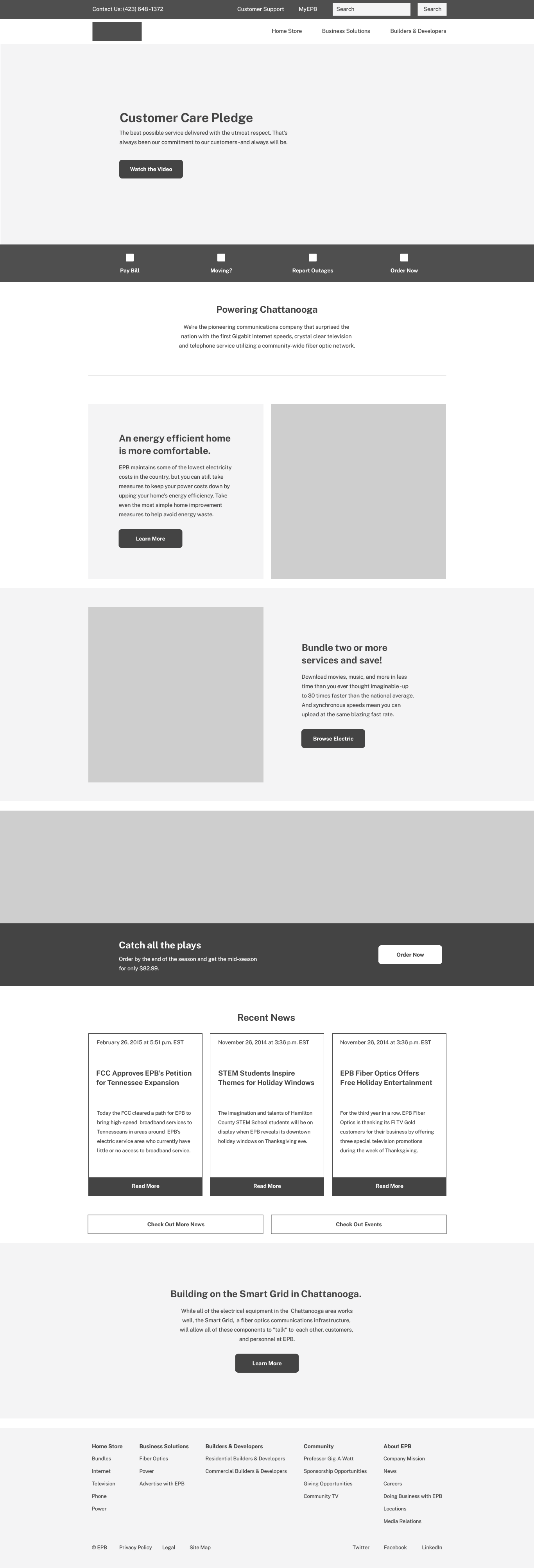
Iteration one | Homepage
The first iteration of the homepage communicated that the user is in control with the primary navigation nomenclature of “For Your home” and “For Your business.” The user dominant approach extended to the support access component.
This iteration also featured a service advertising component. The initial role of this component was to serve as an area for personalized advertisements for current users. If a new user was visiting the site, dynamic content would cycle through with each visit. This pattern also occurred in the image, headline, supporting text, and the call-to-action in the hero component.
Content components supported the two area most frequently visited products, “Fiber” and “Electric (Power).” This iteration of the homepage also featured a content carousel component. This component shifted education about services to education about EPB. The carousel featured the ability to select content categories. In this iteration, the categories included “All,” “Featured,” “News,” and “Events.”
View a full page desktop wireframe of this version of the Homepage →
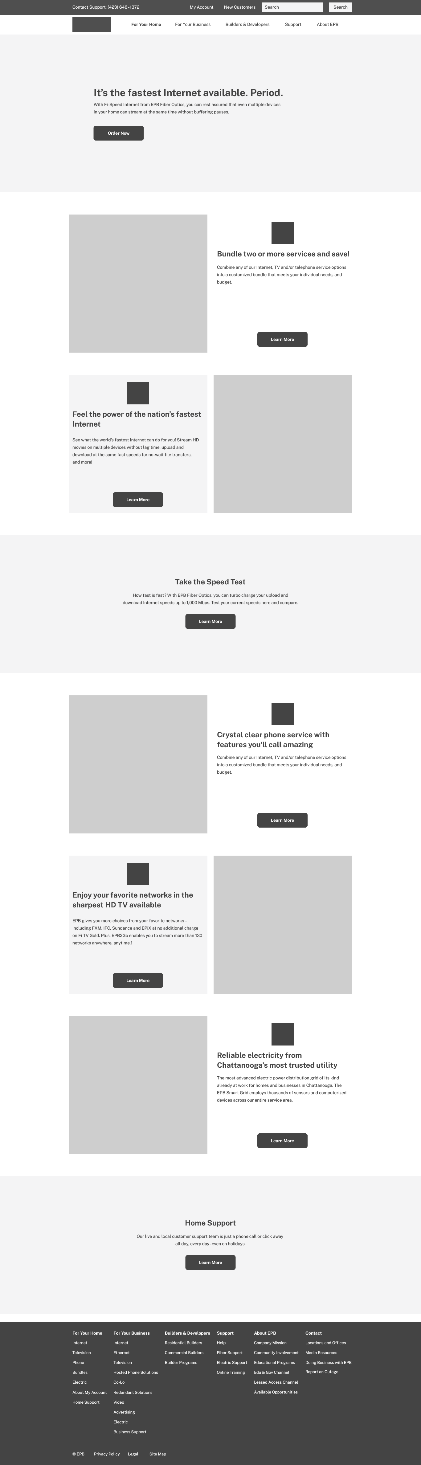
Iteration two | Homepage
The second iteration also put users in control by featuring the support access links and a service component. The service component featured links to service pages. This included “Bundles,” “Internet,” “Television,” “Phone, and “Electric (Power).” Similar to the first iteration, this version of the homepage also featured the service advertising component as well as the content carousel component.
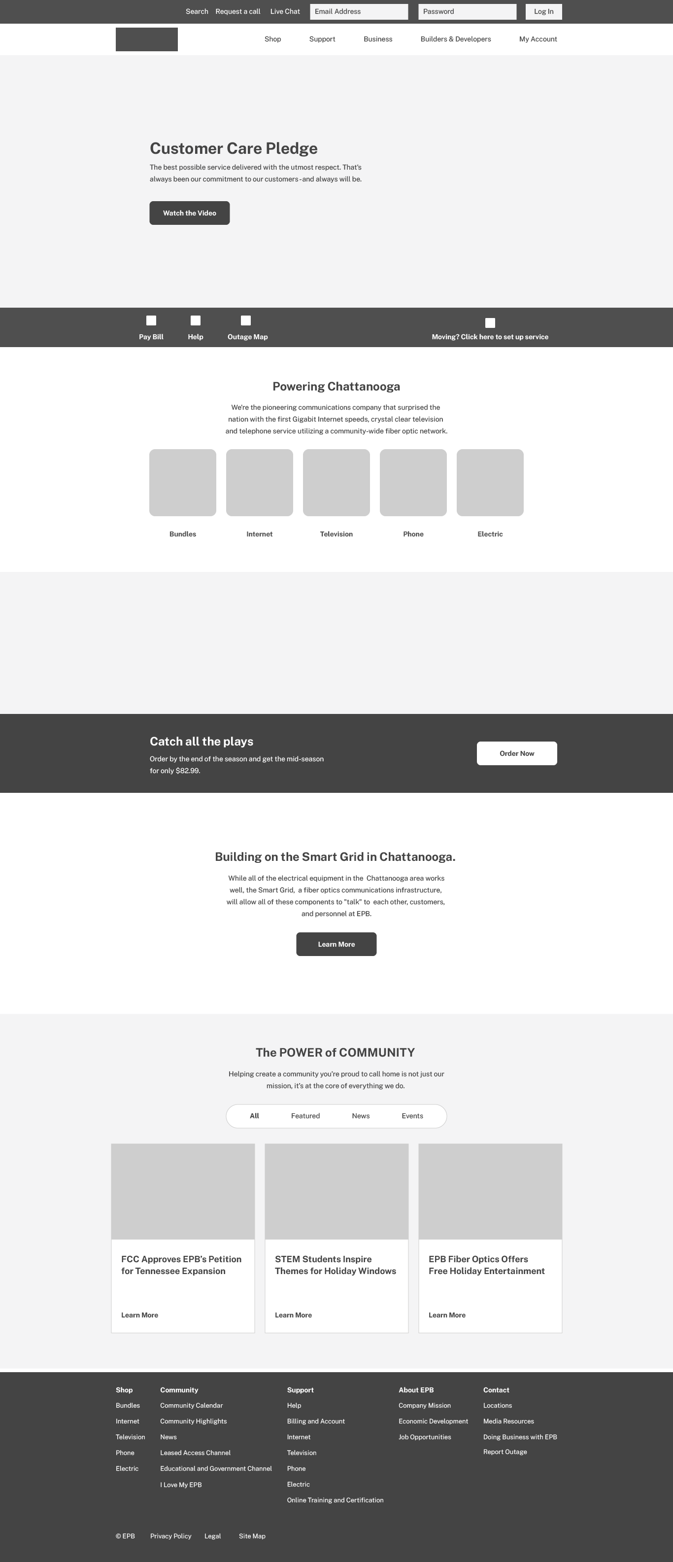
This version of the homepage gave users control by incorporating the links for “Search,” “Request a Call,” and “Live Chat.” Additionally, this version enabled users to log into their service accounts. This version also incorporated the ability for users to log in to service accounts.
View a full page desktop wireframe of this version of the Homepage →
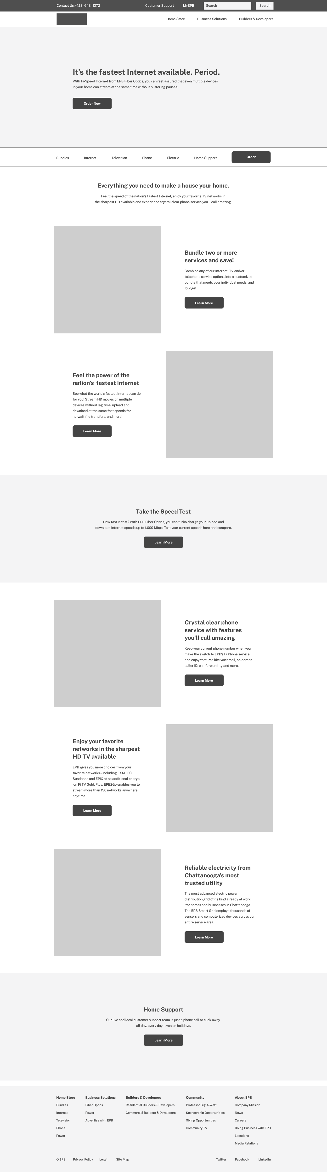
Iteration three | Homepage
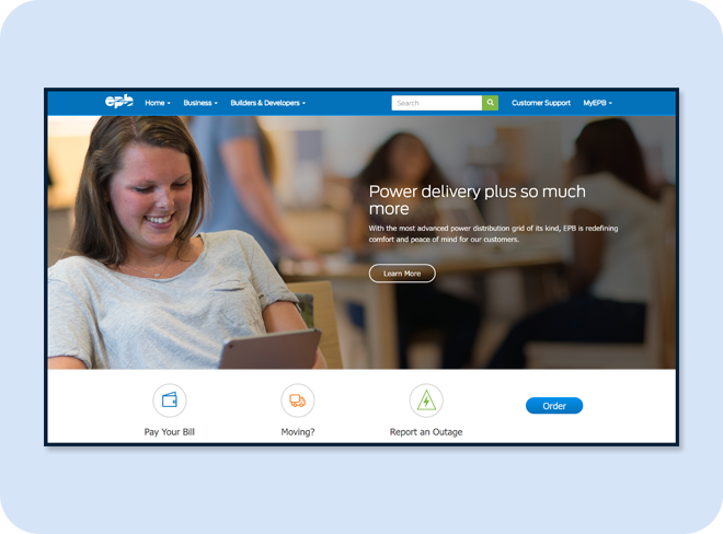
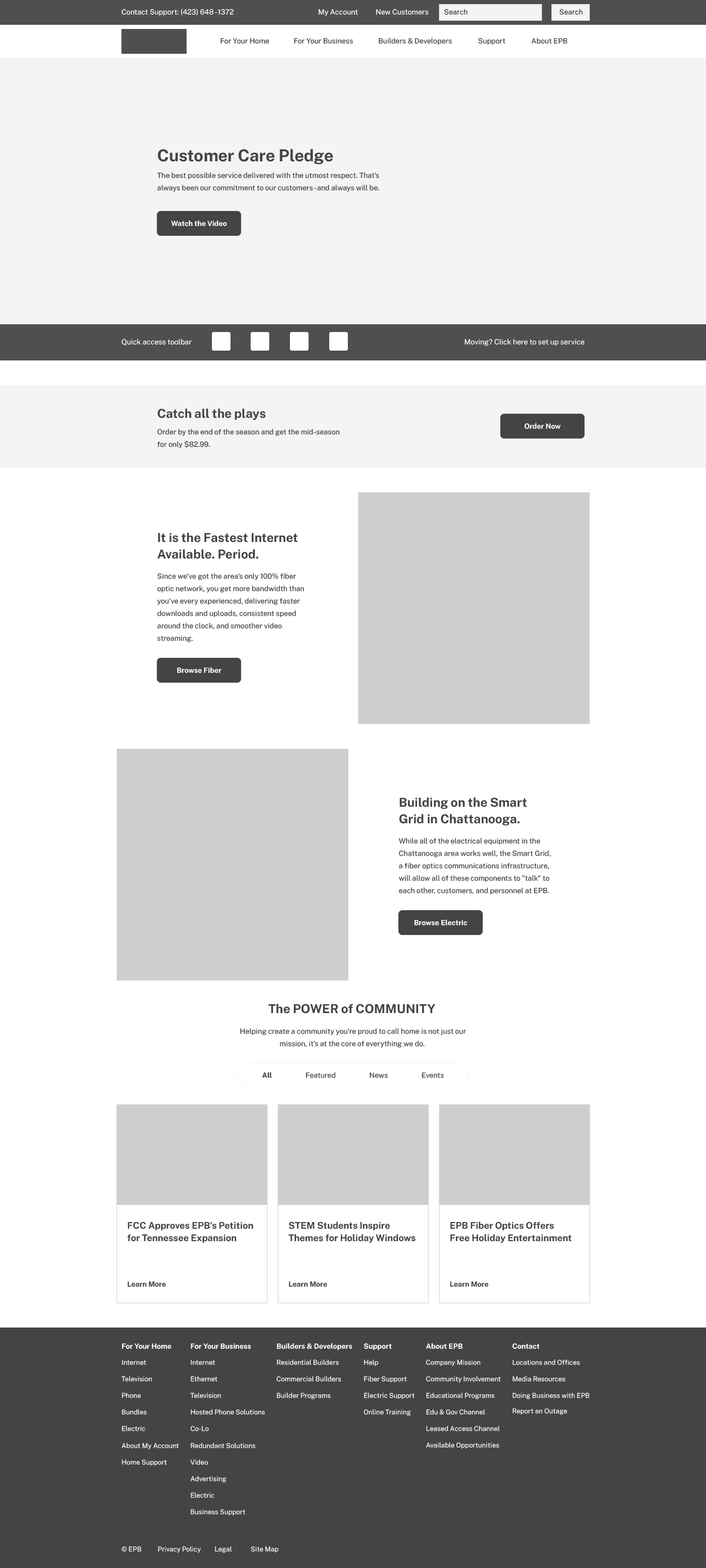
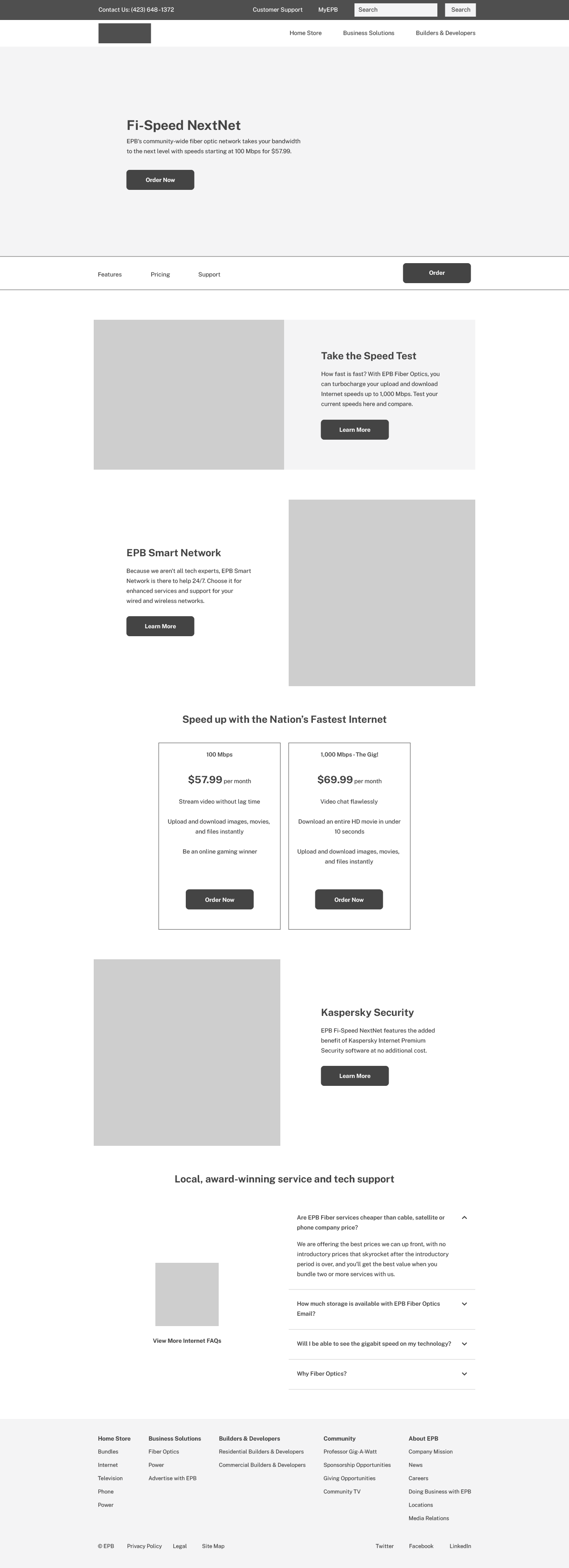
For the project, I handed off the third iteration of the homepage to the digital designer. In this iteration, we streamlined the primary navigation to include “Home Store,” “Business Solutions,” and “Builders & Developers.” The secondary navigation featured “Customer support: (423) 648-1372,” “Customer Support,” “myEPB,” and a search function. The design process involved the removal of the telephone number as it appeared redundant alongside the “Customer Support” link. However, in hindsight, renaming the telephone link could have given customers more control. Moreover, the telephone number enabled users to either call or text for support, adding another dimension of accessibility.
This iteration saw modifications to the support access component, which now included an “Order Now” link and excluded the “Help” link. This iteration reconfigured the carousel component, featuring community news about EPB, to a collection of content cards linking to both a news section and an events section.
View a full page desktop wireframe of this version of the Homepage →
Category page wireframes
Introduction
The next user interactions between products, and support occurred within the category pages. The category pages of the EPB digital experience included “For Your Home,” “For Your Business,” and “Builders & Developers.” These pages continued the user experience strategy of developing content components that improve the accuracy of product expectations by presenting information in small, digestible chunks for easier comprehension.
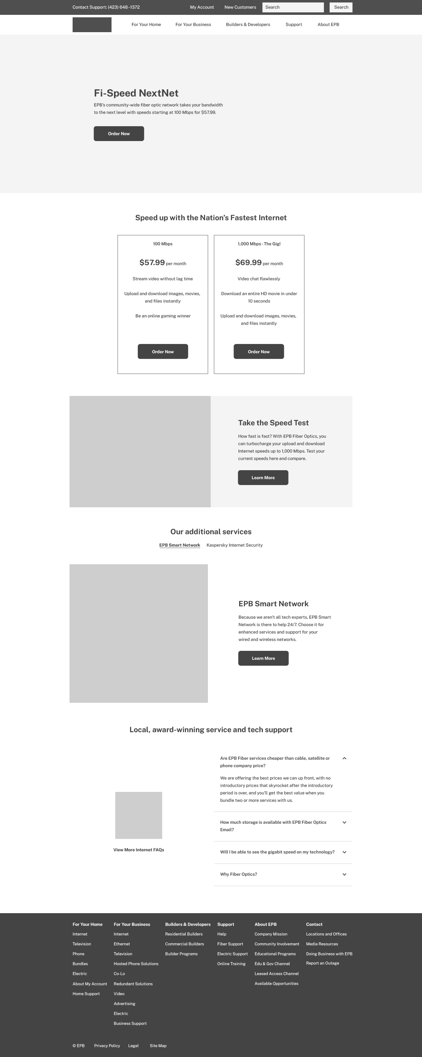
Iteration one | Category page
The first iteration of the category page included proactive service education by featuring each service category. For example, the category page “For Your Home” featured a service hierarchy of “Bundles,” “Internet,” “Phone,” “Television,” and “Power.”
Integrated within the service hierarchy, content components allowed for alternatives to learning about key services. This included a “Speed Test” module to understand how fast the Internet service was. In addition, the “Home Support,” content module provided a quick entry point into timely and relevant service information.
View a full page desktop wireframe of this version of this Category page →
Iteration two | Category page
Due to the amount of content contained within the category pages, this second iteration of the category page introduced anchor links. Anchor links move users down to key product offerings. This component allowed users to personalize their experience and find information and assistance more easily.
The in-page navigation area featuring anchor links adhered to the primary navigation area while users scrolled down the page. Selecting an anchor link led users to a specific content module. From this module, users could navigate to their service of interest.
View a full page desktop wireframe of this version of this Category page →
Service page wireframes
Introduction
Continuing the user flow, the product pages anticipated possible sources of dissatisfaction or uncertainty and addressed those sources before they occurred through a series of content modules. In addition, each product page provides easy access to the service system. The service pages include “Bundles,” “Internet,” “Television,” “Phone,” and “Power.”
Iteration one | Service page
The first iteration of the service page placed emphasis on transparency. Including service card components at the beginning of the content hierarchy helped to achieve transparency. This page also introduced a content carousel component and service specific components to accommodate the diverse range of user learning styles.
This iteration introduced an accordion component for frequently asked questions. This feature, incorporated across all service pages, covered the most common queries. A link to a more comprehensive support page was available for those seeking answers to additional support questions.
View a full page desktop wireframe of this version of this Service page →
Iteration two | Service page
The second iteration of the service page saw an adjustment in the content hierarchy. This included features relevant to a particular service, pricing, and support. This iteration also included in-page navigation containing anchor links.
The integration of in-page navigation further fostered a consistent mental model throughout the site. Another change to the product page involved removing the content carousel component and transforming each of its elements into a standard content component.
View a full page desktop wireframe of this version of this Service page →
Customer Support page wireframe
Introduction
The customer support page, in its only iteration, adhered to the mental models established across the website. It used in-page navigation for quick access to relevant content and prominently featured links to all alternative support channels, thereby catering to varying service needs of the users.
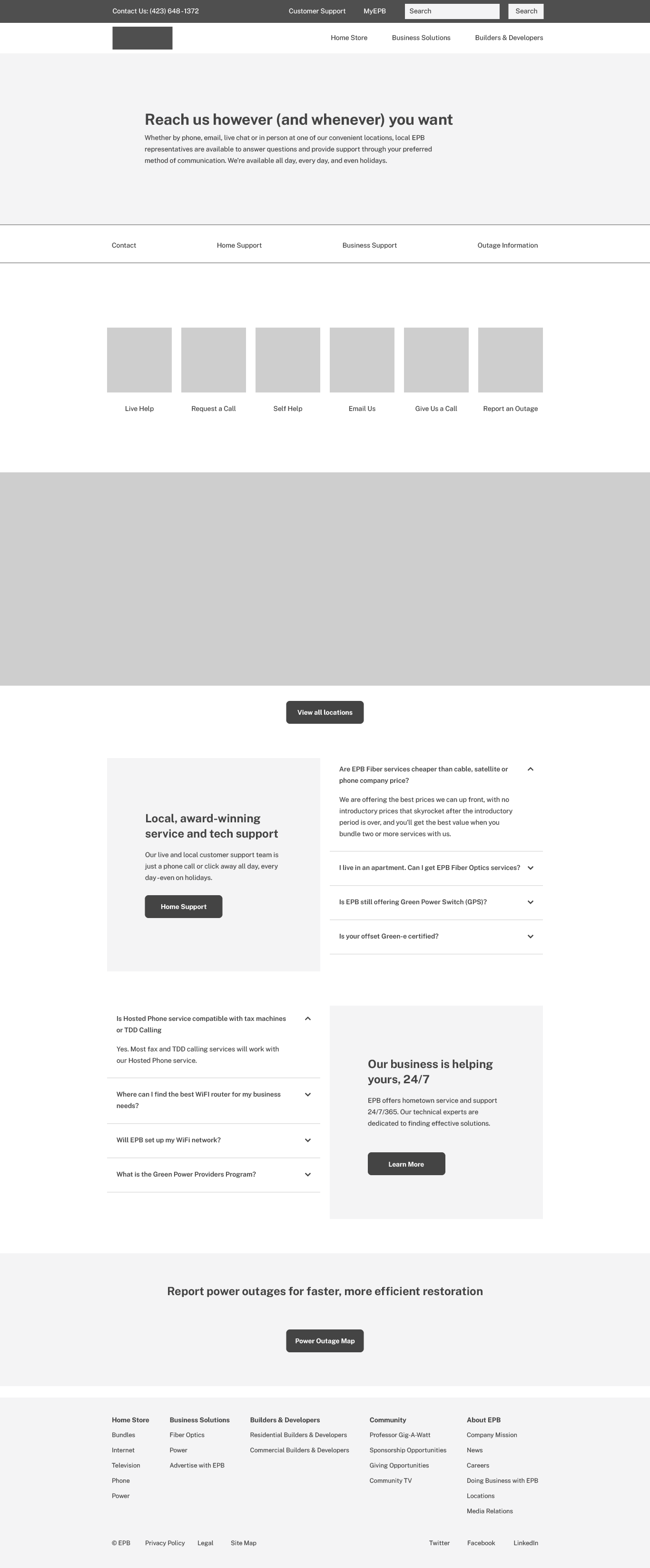
The customer support page included the accordion components containing four of the most common questions by service type. In this instance, service types included “Home Support” and “Business Support.” These content components provided answers to commonly asked questions but also access to ongoing education, support, and billing options.
View a full page desktop wireframe of the Customer Support page →
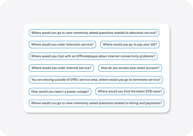
Usability study
Once the digital designer completed the site’s visual design, a usability study took place to gain insights on potential user interactions with the site. In collaboration with the project’s user researcher, the study unfolded at the client’s office using a mobile Tobii eye-tracking station. Participants, both internal and external, fitting the user demographics of the website, interacted with the site design and evaluated how the pages related to each other. Participants completed a series of tasks related to the website.
![]()
Common language in the tasks avoided leading participants to the task’s destination. Participants in the study were asked to read through the scenarios and locate their answers to the tasks’ questions. The insights gained from this data collection informed whether enhancements were necessary for user interactions throughout common task flows.
Closing thoughts
As one of my initial projects in user experience design, this project underscored the critical importance of content and its organization. A website of this size necessitates frequent communication between all stakeholders. Although the final wireframes contain content, the initial, lower-fidelity versions had Lorem Ipsum as placeholder content. Managing communication among stakeholders, handling placeholder content in early wireframes, and content organization presented the most significant challenges in the project.
The value of content communication became evident throughout the information architecture development. Despite the insights garnered from tree testing, the main and secondary navigations underwent numerous modifications.
Additionally, button labels played a vital role in the content. Across the site, most buttons had “Learn More” or “Order Now” labels, but there existed an opportunity to enhance accessibility by providing more descriptive links.
Another significant consideration was the use of in-page navigation, and we incorporated anchor links throughout the site. Even though eye tracking affirmed this design decision, the mental model required additional clarity. For instance, including a label such as “On this page” could have improved the structure. Post-launch, the in-page navigation incorporated both in-page links and navigation links, which led to user confusion.
In retrospect, there was a missed opportunity to include content components that reflected the voice of the customer. While the featured content primarily focused on the client’s services, we could have done more to represent the customer’s perspective. Despite using imagery to shift focus towards a customer-centric approach in the design phase, the content could have benefited from a stronger emphasis on the customer’s voice.
Considering these factors, conclusive determination of the project’s three goals is not feasible, given the lack of data to assess the impact of the website design.
Gauging the success of the first goal—merging two existing websites into a single, user-friendly service system that proactively educates customers about the products and provides support—required tracking customer inquiries about basic product information and assessing customer satisfaction post-launch.
Similarly, assessing the success of the second goal—improving the accuracy of product expectations by presenting information in bite-sized chunks for easier comprehension—involved monitoring customer inquiries about product specifications and measuring the time users spent on product pages.
Finally, evaluating the success of the third goal—enhancing the digital platform to allow users to personalize their experience and find information and assistance more easily—involved observing user engagement rates and bounce rates.